|
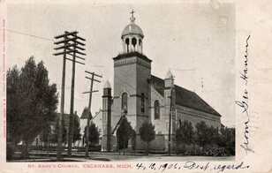
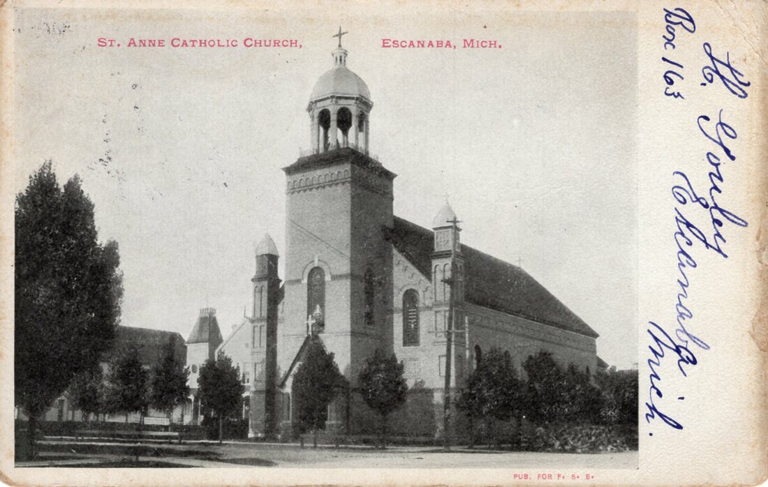
In Variations we feature two or more cards that were based on the same photograph but contain certain differences. In this post, we take a closer look at two undivided back cards depicting St. Anne Catholic Church: The major variation is pretty obvious: the telephone poles and wires have been mostly removed from the card on the right. We say 'mostly' because, if you look closely, you can see that portions of the wires remain in certain parts of the image, and at least one entire pole is left standing. In total, we can see three main variations:
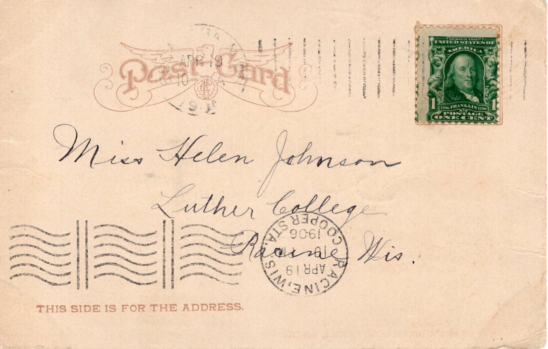
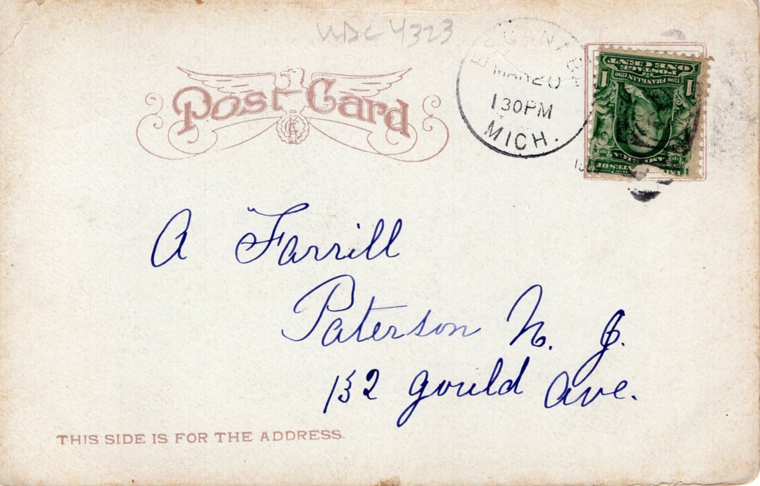
The publisher's info tells us the card with the poles was made for Monaghan's Book Store, and the updated card for Fair Savings Bank, which was Escanaba's largest department store at the time. Both cards were published by E. C. Kropp out of Milwaukee, and share an identical reverse: It's worth noting that these two cards were postmarked almost one month apart, in March and April of 1909, but the updated card bears the earlier postmark. This seems to indicate that both were available for sale at the same time. It's likely that Kropp initially provided the untouched card to stores and later offered a retouched version. It also seems likely that Fair Savings Bank would turn over their stock quicker than Monaghan's Book Store, which might explain how both versions of the cards were sold and mailed around the same time.
While we think both cards look pretty good, the airbrushing seems to have had an overall softening effect on the image resulting in a loss of detail throughout. There's no question, however, that the removal of the telephone poles and wires allows the viewer to focus on the church. Which version of the card do you like better? Let us know in the comments below. Check out our St. Anne Catholic Church exhibit for a closer look at these and other cards.
0 Comments
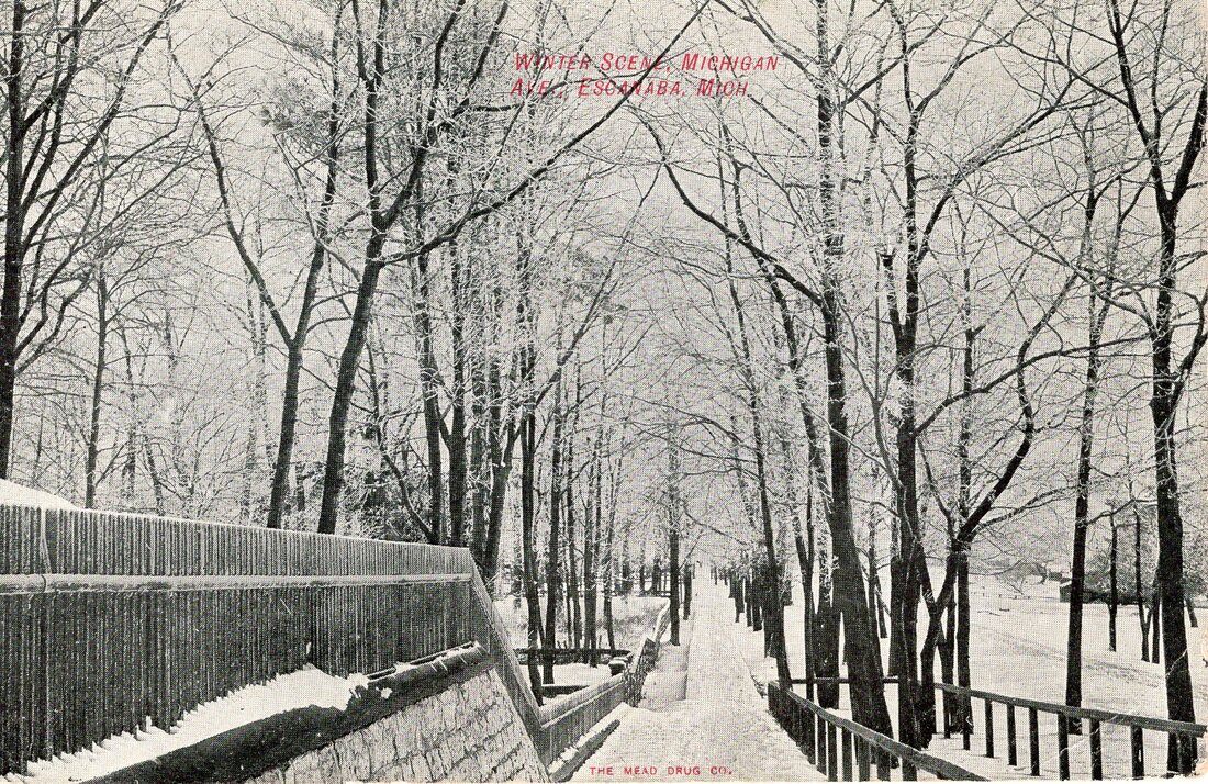
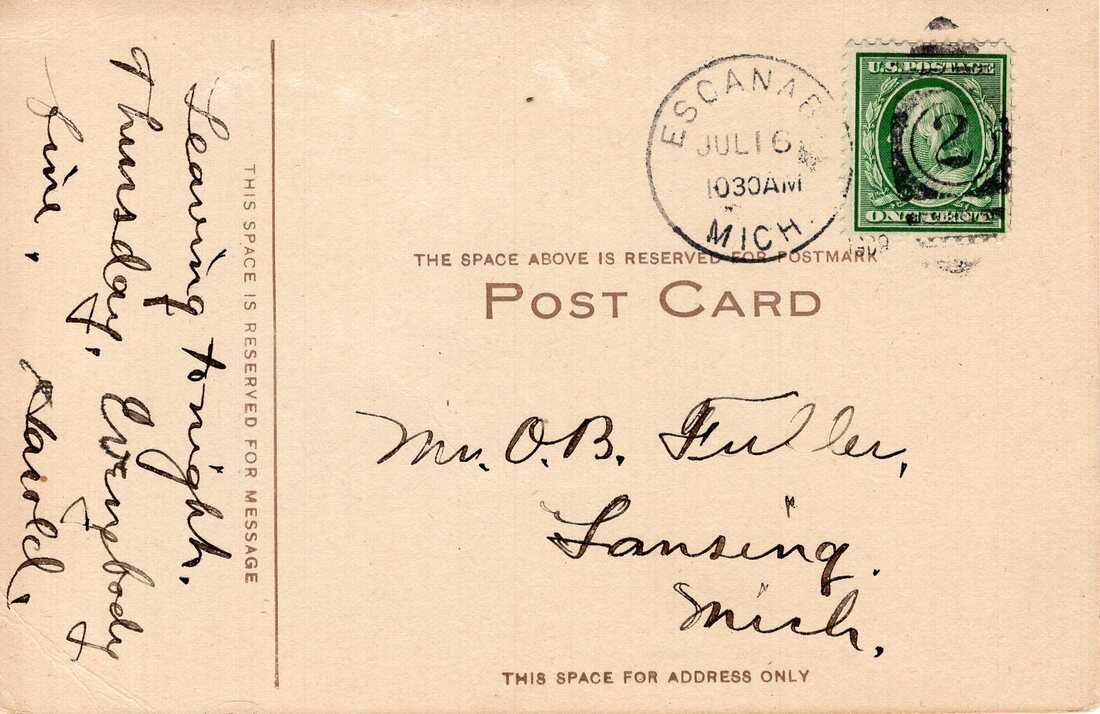
In our second Messages post, we examine a card depicting a winter scene on Michigan Avenue, known to modern-day Escanabans as Lake Shore Drive. The view is fitting, as Escanaba and the surrounding area currently struggle through a particularly cold and snowy January. But this is a Messages post, so let's flip the card over and see what it has to say: Right away, we notice a few things:
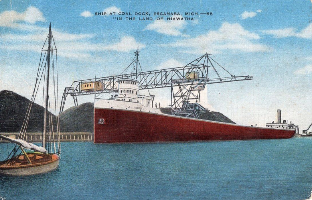
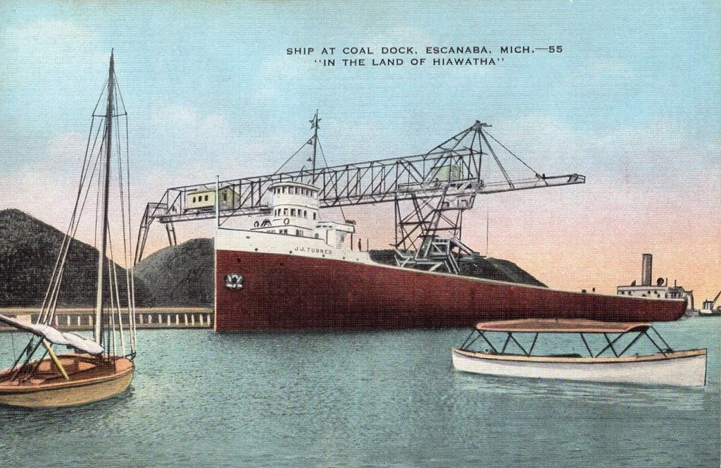
So the next time you're sitting around the campfire at Fuller Park, take a moment to remember O. B. Fuller and his old buddy Harold. This card is located in our Other City Streets exhibit. Do you know more about O. B. Fuller or the mysterious Harold? If so, let us know in the comments below. Thanks! Variations is a new feature we're introducing with a very puzzling set of cards. Variations refers to multiple cards that are clearly based on the same photograph, but with subtle–and sometimes not-so-subtle–differences. Often these cards are even from the same publisher or printer. Many variations simply feature different color schemes, or the removal of small items–clouds and telephone wires seem to be the most popular items commonly airbrushed out of old postcards. In fact, sometimes the telephone wires disappear, leaving the poles holding absolutely nothing aloft! The two cards featured in this post are both from the linen era, and clearly were made from the same original photograph. They were both published/printed by the E. C. Kropp Co. of Milwaukee, Wisconsin. Both cards feature the same title and series number on the obverse, and a similar item number on the reverse. Titled 'Ship at Coal Dock', both cards depict the J.J. Turner at the Escanaba coal dock in the process of unloading. A small sailboat appears to be at anchor in the left foreground. Depending on the card, a small motor launch is visible in the right foreground. The cards contain three variations: two common variations--color and clouds--and also one of the most obvious object removals we've ever seen. Here's a look at the variations:
High-res obverse and reverse images of these cards can be viewed by visiting our Coal exhibit. The question that comes to mind when looking at these types of variation is, why? It could be argued that the changes to the sky enhance the beauty of the card, and the Turner does stand out a little more and seems to appear slightly longer without another boat in front of it, so perhaps that's why.
'Why' is closely followed by 'how' when contemplating a variation of this magnitude. Nowadays, this type of photo manipulation could be done in minutes using Photoshop or similar software. But what was involved to accomplish something like this back in the day? And why bother with something that clearly must have been a time consuming process? Lastly, while it may or may not be relevant, it's interesting to note that the card without the small boat appears much more often on online auction/sales sites as the card with the boat. Is this because fewer of this card were made, or simply that fewer survived to be sold? Of course, we'll probably never know the answer to any of these questions, but it certainly makes an otherwise ordinary card a little more entertaining when you take into account its mysterious twin. Have an idea about any of these variations? Let us know what you think in the comments. As Escanabans cheer the 2017 Eskymos football team into the playoffs, it seems fitting to highlight a card that looks back on this longstanding local tradition.
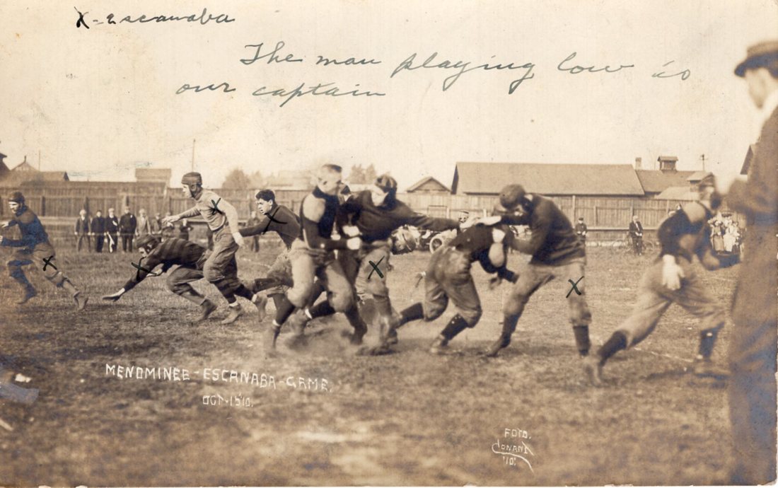
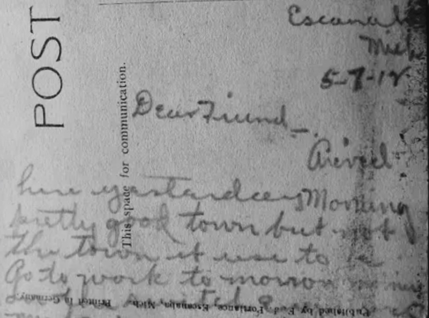
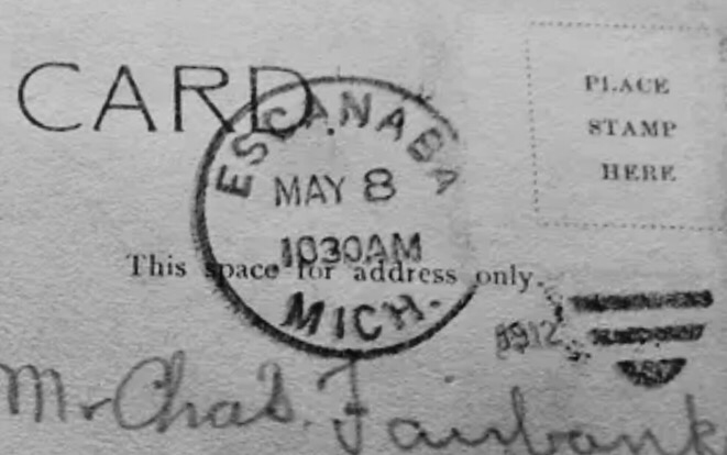
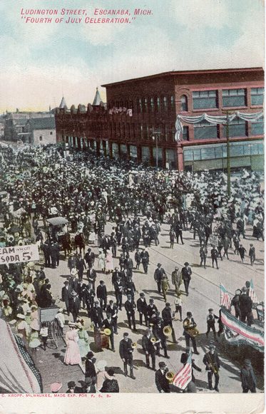
Here we see a game that took place between Escanaba and arch-rival Menominee in October of 1910. Caught in mid-play, this great real photo postcard certainly shows the similarities and differences of the game from 107 years ago. Helmets optional! The message on the back tells the rest of the story: “Smash em! Bust em! That’s our custom! Who says so? We all say so! Who are we? Escanaba High School F. B. T.!” This and many more yells is all I heard on our trip home yesterday after we had scored 21 – 0. Click the image above to visit our Football exhibit, with high resolution scans of the front and back of this amazing card. The obverse (front) of a postcard is arguably its most important side. The image takes us back to an earlier time in Escanaba, and is almost always the first thing we look at when picking up a new card. Image type is also how we categorize cards into exhibits. In fact, the image on the front is what prompts someone to buy a postcard in the first place. There is something to be said for what's written on the reverse, or back side, however. While a postcard's picture certainly speaks 1,000 words, often it's the ten or twenty words on the back that tell the true story. Collectors seek out 'mint' cards that are in pristine condition, but we find those cards to be almost a little boring. If the history inherent in a postcard is part of its value, then a card with only one side to view could be considered worth only half as much. With this in mind, we're introducing Messages, a new feature that will focus on the message, in the hopes of learning a little more about Escanaba and the people who called it home. Our first post brings up an interesting concept, that Escanaba isn't the city it used to be, that it's somehow diminished over time. Lately, we seem to hear more and more about Esky's decline, due largely to the prevalence of social media and the ease by which people can share their opinions. A hundred years ago, postcards were the social media of the day. And it seems that these types of opinions never go out of style. "Dear friend - Arrived here yesterday morning. Pretty good town but not the town it use to be." What's so interesting, of course, is that this particular opinion was expressed over 105 years ago! The card is postmarked May 8, 1912. One can only imagine what this person saw in 1912 that made him long for 'the good old days'.
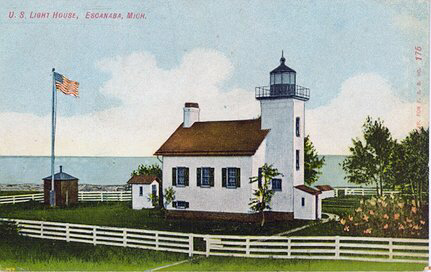
Nowadays, it seems as though we hear something similar almost on a daily basis about Escanaba. Apparently, it's not a new concept that the Escanaba we see before us is somehow in worse shape than the Escanaba of our memories. We're not sure if that's comforting, or not. The Sand Point Lighthouse, easily one of Escanaba's most recognizable landmarks, will celebrate 150 years next month. Click the image above to view our Sand Point Lighthouse exhibit, including historical information and additional views.
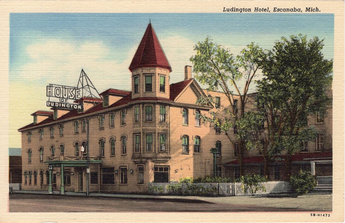
For more information about the upcoming celebration, check out this recent article in the Escanaba Daily Press. As reported recently in the Daily Press, it looks like the ongoing project to convert the historic House of Ludington into affordable senior housing is still moving forward. While the project has stirred much controversy in the community, we won't get into that here. Instead, let's take a look back at Escanaba's iconic hotel. Click the image below to view our entire House of Ludington exhibit.
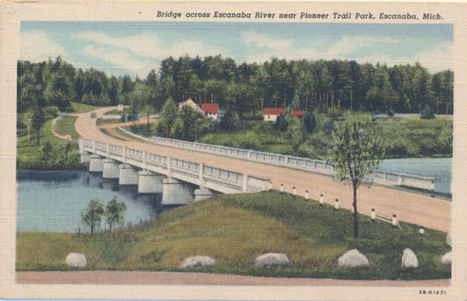
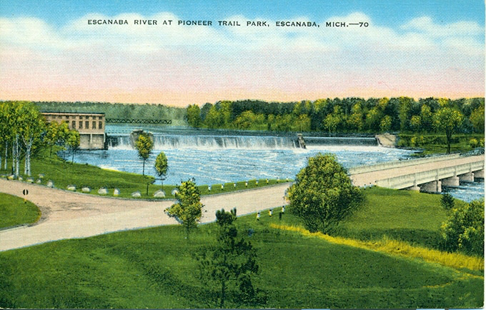
Today marks the beginning of a multi-year project by MDOT to completely rebuild the US-2 bridge across the Escanaba River near Pioneer Trail Park. Running from April of 2017 through October of 2018, this construction project will likely be a headache for many commuters. We thought it was also a great opportunity to take a look back at the 'new' bridge.
The current bridge was constructed in 1929, replacing the original auto bridge that spanned the Esky closer to its mouth. It was widened in 1956 and received numerous small repairs over the years, but is now considered 'functionaly obsolete' by MDOT. The new bridge will feature several improvements, including an additional 37 feet in width to accommodate wider shoulders and a pedestrian pathway. Part of the project includes the replacement of a nearby E&LS railroad bridge across US-2. We plan to write a Then & Now post once construction is completed next year. In the meantime, enjoy these views showing the bridge in its heyday. Clicking the images will take you to their corresponding exhibits. |
Categories
All
Archives
February 2019
|
 RSS Feed